Background
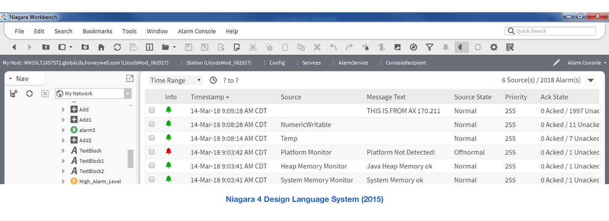
The Niagara 4 design language system (DLS) was designed in 2014-2015. Since that time, some usability issues were identified and put in the backlog for Niagara 5. Additionally, shortly before the N4 DLS was introduced, the flat design trend was picking up momentum as evidenced in other digital platforms like smartphone operating systems, such as Android 4 "Ice Cream Sandwich" (2011) and iOS 7 (2013).
Responsibilities
As the Principal Experience Designer for Niagara, I helped prioritize UX items for each release, then led the design, product, and business teams during product increment and sprint planning to execute design and development.
Actions
We decided that the fifth release of the framework would be an ideal opportunity to do a significant visual and interaction design update of the Niagara DLS. I worked with three team members in Shanghai and Bangalore to lead this work, and we completed the update in advance of the development teams needing it.
Results
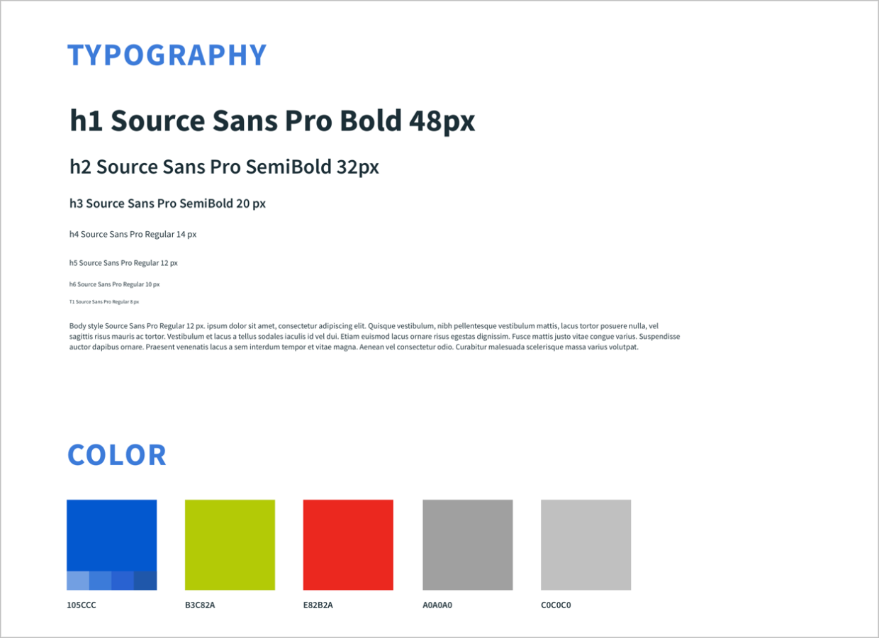
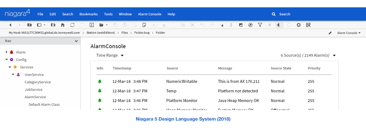
Usability studies with customers during and after the design of the new DLS confirmed that new typography, higher contrast, more use of saturated color, and getting rid of unnecessary visual treatments (such as rounded corners and dark drop shadows) made the software more pleasant, easy, and efficient to use. Using a five-point Likert scale, the rating of the updated design language went up nearly 40%. Reviews by our sales and marketing specialists were also very positive, who were happy that Niagara "no longer looked dated" or suffered from "too much gray."
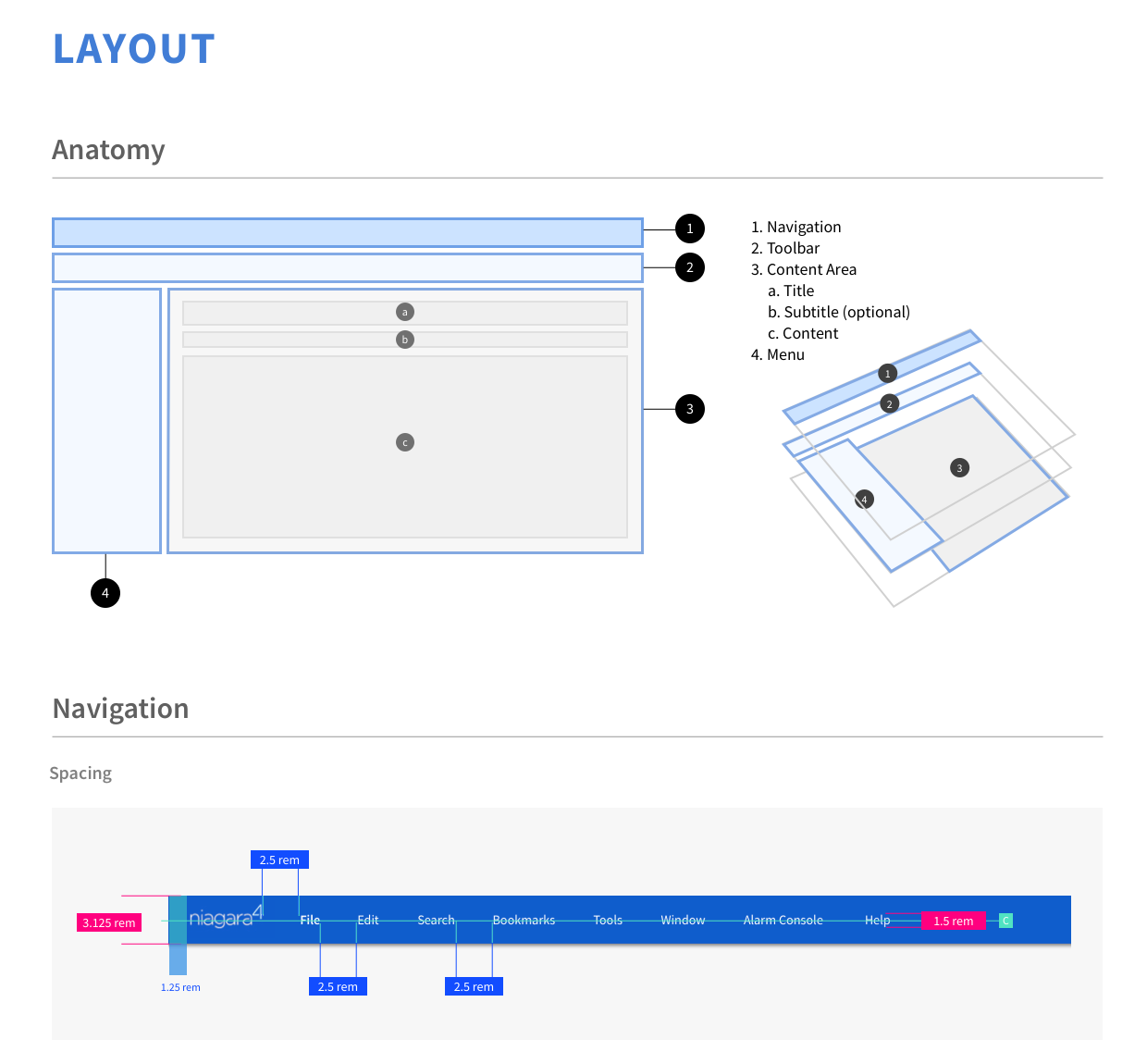
Niagara 5 has not yet been released; some principles and examples of the updated DLS are displayed below.